Website Design Projects
Frameworks Employed In All Of Our Designs
Responsive Website Design (RWD)
Can not stress enough the importance of this paradigm. Not having your site designed as responsive is akin to still using Windows 95 or Notepad to design a CV. It might just still about do certain things or run certain applications but at what cost - security, productivity, connectivity, efficiency and the list goes on and on.
The aforementioned notwithstanding,smartphones so omnipresent is a very compelling reason to implement RWD. You do not want to miss out on the millions accessing the internet through this device. The desktop or laptop are no more the default gateway to the web. RWD incorporates functionalities that ensure consistent user experiences irrespective of their device type when viewing and interacting with website content.
Client Main Objectives
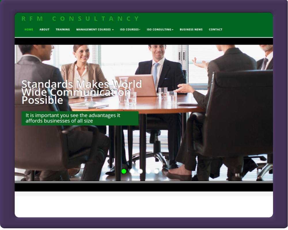
RFM Consultancy is a highly specialised company that provides it services to corporate enterprises, NGOs', local governments and private companies. They provide training to administrative and senior management teams in a variety of subjects that range from Auditing, ISO, Cloud Computing to Good Governance. As a mainly services provider, they wanted their website interface to focus on their subject matter predominantly
The design we opted for incorporate parallexing with lots of high resolution graphics infused. Video containers to play appropriate video content with a click of the mouse. This implementation uses pop-up windows to play the videos in. This ensures the client is not too disorientated from the page linking the videos. It works seamlessly on all standard web browsers and retina screens - regardless of the device and platform
There is a bespoke responsive email functionality within the design,that allows the sending out of corporate branded emails to any recipient without using an Email Client Application. When the necessary info are filled in and the send button clicked, a responsive HTML5 email curated with similar interface as the website with appropriate content and graphics is sent to the recipient automatically. Being responsive, when view on any device (desktop,laptop,tablet or smart-phone)- the experience is consistent. Emails produced this way, have a greater response rate than ordinary text email. Powered by PHP at the back-end,this help in promoting and advertising their services to clients and potential customers respectively.
CSS and javascript provided intuitive and interactive frontend interactions.
-
Major Software Tools:
Adobe - Photoshop_cc and Dreamweaver_cc -
Price:
£550 -
Duration:
2-Weeks - 50 man hours
Total No Of Pages
- HTML5
- 10
- PHP
- 5
- JavaScript
- 5
- CSS
- 4
Total No Of Graphic Assets
- JPEG
- 30
- PNG
- 20
- GIF
- 10
- SVG
- 4