Website Design Projects
Frameworks Employed
Responsive Website Design (RWD)
Can not stress enough the importance of this paradigm. Not having your site designed as responsive is akin to still using Windows 95. It might just still about run certain applications but at what cost - security, productivity, connectivity, efficiency and the list goes on and on. The aforementioned notwithstanding,smart-phones so omnipresent is a very compelling reason to implement RWD.
You do not want to miss out on the millions accessing the internet through this device. The desktop or laptop are no more the default gateway to the web. RWD incorporates functionalities that ensure consistent user experience irrespective of their device type when viewing and interacting with website content.
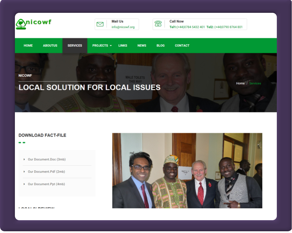
Client Main Objectives
Being a site that heavily relies on promoting and talking up local issues, the interface was designed with that foremost in our mind. Waltham Forest is a borough in East London with a heavily populated ethnic minorities of which, Nigerians make up sizeable proportion. NICOWF - Nigeriancommunity In Waltham Forest is an umbrella charitable organisation with objectives to put local people grievances to the authorities in a very coherent and constructive manner.
We decided to design an interface that will showcase these objectives in a very professional and corporate manner. Unlike other charitable organisation sites, we stayed clear of simplistic and cartoon like interface. The pre-dominant green colour in the interface was pick up from the borough's website theme of emphasising green credential within the borough's services.
Interface interaction has both javascript and CSS3 induced transitions to add and enhance visual clues. We deliberately used lots of high resolution photographs captured during various events within the borough to en-hence the looks of all pages as seen on the site.
There is a bespoke responsive email functionality that allows the web-admin to send out email from a simple form with form fields just for the recipient email address and title and a sendbutton. Want the necessary info are filled in and the send button clicked, a responsive HTML5 email curated with similar interface as the website with appropriate content and graphics is sent to the recipient. Being responsive, when view on any device (desktop,laptop,tablet and smartphone)- the experience is consistent. Emails produced this way, have a greater response rate than ordinary text email.
CSS and javascript provided intuitive and interactive frontend interactions. The backend is powered by php with a functionality to send bespoke crafted branded responsive emails to contacts and prospective customers
-
Major Software Tools:
Adobe - Photoshop_cc and Dreamweaver_cc -
Price:
£550 -
Duration:
2-Weeks - 50 man hours
Total No Of Pages
- HTML5
- 10
- PHP
- 5
- JavaScript
- 5
- CSS
- 4
Total No Of Graphic Assets
- JPEG
- 30
- PNG
- 20
- GIF
- 10
- SVG
- 4