Request Form
Please make sure all fields are filled
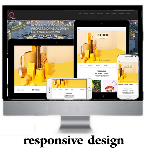
With the ever-increasing use of mobile devices, it has become necessary to design on-line content that appears on multiple screen
sizes and a myriad of devices with varying form factors. The challenge involves designing sites that adapt to fit a variety of different
resolutions and use the available screen real estate effectively. Previously, these goals have proven to be time-consuming. Hand-coded
media queries and complex mathematical calculations were often required to deliver on-line presentations with fluid layouts to reach the
widest audiences.
CSS3 media queries - now a standard specification in HTML5 allow designers to dynamically alter the design and layout of a web page in
order to deliver an optimal user experience from a single set of HTML, CSS and JavaScript files. The techniques involve in leveraging this
powerful capability of CSS also facilitate the change of images, altering navigation style and a whole lot more dynamically.
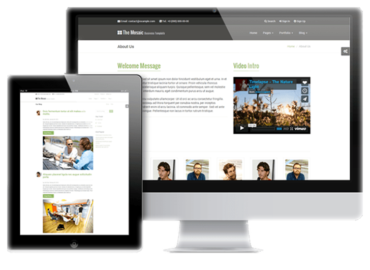
Adobe Dreamweaver CS6 (2012) introduces the Fluid Grid Layout feature to help make designing for multiple screens easier.
Prior to Adobe CS6 release, an open-source toolkit (framework) called Bootstrap from Twitter has been widely used to facilitate
the creation of responsive wed design. Within the design and development communities Twitter Bootstrap is considered the most
watched and forked repository in GitHub. A wide variety of websites and mobile apps use this framework.
Responsive web design is essentially based on a fluid grid layout. All containers on the page have their widths defined in
percentages - meaning that they are completely based on the viewport rather than the initial containing block. A liquid
layout will move in and out when you resize your browser window. Thus, all siblings or nested entities within the container
are adjusted correspondingly.
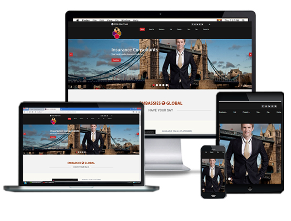
If you're an owner or stakeholder in a website that still employs separate code base for various connecting
devices (smart-phone, tablet,desktop, TV etc.etc.) you have a decision to make about your entire website strategy.
It's no longer a question of if you need a redesign, but how soon to redeploy your current site implementing RWD.
Thus leverage the new specifications in HTML5 and CSS3 to render consistently across various devices. Creating separate
website templates and code for phones, smart phones and tablets is completely unnecessary, unproductive notwithstanding
cumbersome. Responsive Web Design (RWD) allows your website to respond and display nicely on the device that it is being
displayed on. Consequently ending up with a site that provides the same user experience across devices, screen resolutions
and varying form factors.
Please do note that the clients listed below all came to us as a result of personal recommendations. They very much new nothing about the web let alone
the fundamental technologies involved. One thing the knew for certain was that it is where everything is happening. They needed someone to
take their ideas and make it happened so to speak on the web - And that's what we do here at ToromeTech.
Click on the vertical tabs on each client 's section to see how the sites were designed
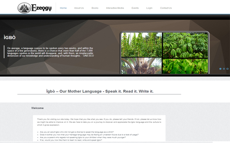
We are here to take you on a journey to discover and appreciate not only the Igbo language but also the culture to which it gives expression
General theme should exude subtle colours and large expanse of margins and paddings that depict an uncluttered interface
In the design process, the business imperative as narrated by the client is of the essence. This is why they've come to us. Our design methodology is encapsulated in these four phases: Discovery - Design - Deployment - Delivery. Each of these consulting phases, defines a clear step in the process of taking the solution of a business problem from concept into production. The client is alway in tune with what is going on. This facilitate a smooth transfer of control after completion.
To effectively bring the client in to the design and development processes, a common venue had to be established. The most convenient and suitable location was the internet. thus, a private area was setup where client can log in and see how development was progressing. More importantly here,they could query issues they were not happy with and the development team can respond for them to see the immediate effect of their suggestions -
This final stage of the design cycle was rather straight forward because it is invariably dependent on the preceding phases. Thus it was merely transferring the entire package from it testing platform on to a production one. Here, the databases for managing both the on-line book selling functionality and administering access to the on line Interactive Audio Application were implemented and tested. Paypal was the obvious choice for completing the e-commerce section due to it simple and intuitive modules.
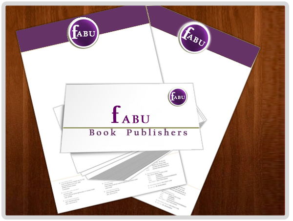
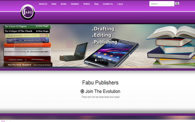
Fabu Publishers is a Foundational Publishing house based in London. We have developed into a leading publisher of historical, cultural, educational and religious publications to name but a few. Our books focus particularly on fostering a better world order and promoting self-transformation. Our themes are Self-awakening irrespective of your denomination. Foundational thoughts are not merely academic but real food for thought for the discerning.
General theme should exude a bright colour specified by client
Our design methodology is encapsulated in these four phases: Discovery - Design - Deployment - Delivery. Each of these consulting phases, defines a clear step in the process of taking the solution of a business problem from concept into production. The client is alway in tune with what is going on. This facilitate a smooth transfer of control after completion.
To effectively bring the client in to the design and development processes, a common venue had to be established. The most convenient and suitable location was the internet. thus, a private area was setup where client can log in and see how development was progressing. More importantly here,they could query issues they were not happy with and the development team can respond for them to see the immediate effect of their suggestions -
This final stage of the design cycle was rather straight forward because it is invariably dependent on the preceding phases. Thus it was merely transferring the entire package from it testing platform on to a production one. Here, the databases for managing the on-line book selling functionality , contact form , newsletter, blog and news functionalities were implemented and tested. Paypal was the obvious choice for completing the e-commerce section due to it simple and intuitive modules.
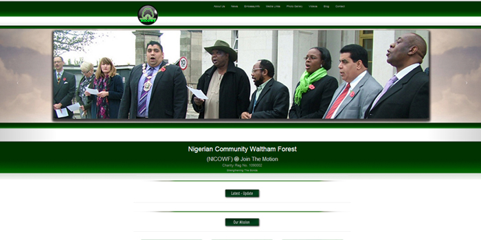
The Nigerian Community Waltham Forest (NICOWF) is a charitable organisation born out of the necessity to foster and strengthen the bonds among Nigerians living in the borough
The general theme should reflect the national colours (GREEN-WHITE-GREEN ) with large expanses of margin and padding that depicts an uncluttered interface
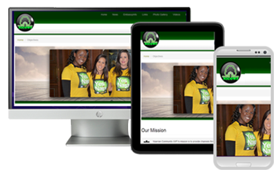
There are multitude of different screen sizes across phones, tablets, desktops and TVs,. Screen sizes will always be changing, so it’s important that your site can adapt to any screen size, today or in the future.
Responsive web design, responds to the needs of the users and the devices they’re using. The layout changes based on the size and capabilities of the device. For example, on a smart-phone, users would see content shown in a single column view where as a tablet might show the same content in two columns.
The fundamentals of the responsive design concept is based on a grid structure made of columns.
A maximum of 12 will be utilized to display content for a typical desktop and anything bigger (TV). Tablets , smart-phones
and smaller screen devices will use progressively less. The magic in rendering the same content for devises of varying screen resolution and sizes is in the css file
(CSS - Cascading Style Sheet)
To effectively bring the client in to the design and development processes, a common venue had to be established. The most convenient and suitable location was the internet. thus, a private area was setup where client can log in and see how development was progressing. More importantly here,they could query issues they were not happy with and the development team can respond for them to see the immediate effect of their suggestions -
The main broadsheet and television to a certain extent have always argued that the principle of reviewing books that are only published through well-renowned publishers had inbuilt quality control they could not do without. It now seems the quality control factor was merely a smoke screen for maintaining the old school boy network. This hitherto sacrosanct principle is now being reviewed,revised or ditched completely. There now seems to be a change in the wind - or to put it bluntly a revolution in the making. As more self-published authors hit the big time, that reputation (of vanity,flagrant ego etc,etc.) is definitely beginning to diminish. Self-published authors are now thought of as entrepreneurs, energetic souls determined to forge their own identity and destiny in the cultural landscape.
Here at Torome Tech, we have the expertise to help you bring your dreams to fruition. it is generally said that, everyone has got a book in their head. Be it fiction or non fiction. The problem has always been the expense in getting it published. Well to a certain extent that obstacle has been rendered obsolete. Not because of the caprices of the big publishing houses but due to innovation in technology and the increasing power designers and programmers have in affecting how information is presented and consumed on the Internet platform. Thus you do not have to have a physical book so to speak(i.e printed) . Your book will reside on the internet to be consumed in a digital format only. That is to say people can read it online on their chosen platform (Tv,desktop,laptop,tablet, or smartphone). You can give it gratis or incorporate a charging scheme of your choice.This by and large, will be on a pay-access basis. Just in case you are one of those averse to digital books, the tangeable option can easily be realised from this juncture. You just have to say the number of copies you want and it get send to the printers - and that is it. You only need to have your story out of your head and we will do the rest. Interested - talk to us.